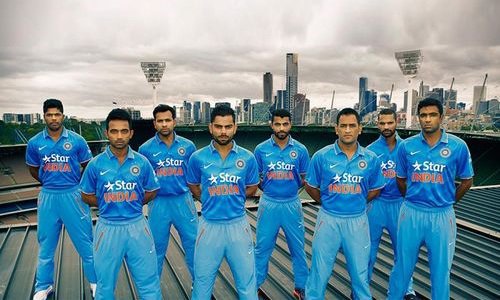
The Indian cricket team has been in coloured clothing for almost 30 years now. Every few years, the jersey has changed or been modified. From ridiculous fashion disasters to stylish designs, the cricketers have donned the colours with pride and honour. Let’s have a look at how India’s ODI jersey has evolved over the years:
1. The late 1980s
Back when things were plain and simple. No team name, no sponsors and no brand. Just the colours!
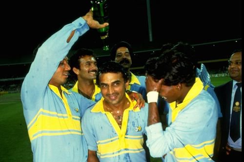
2. 1992
The Indian team switched to dark blue for the 1992 World Cup with the team name in the front and the player’s name on the back.
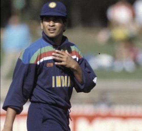
3. 1993
India suddenly switched to yellow with a band of blue running in front with the team name. The track pants, however, were light blue.
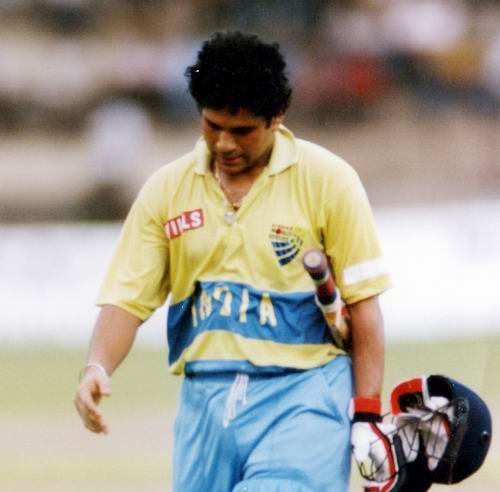
4. 1994
The yellow continued for a while. But the light blue colour became more dominant on the jersey.
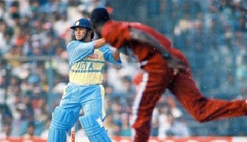
5. 1996
During this World Cup, every country had a similar jersey. Each country had its own colour but there was a colourful band across the chest and back, signifying the participation of the other teams at the tournament.
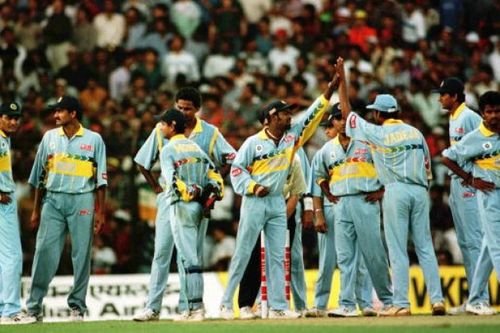
6. 1997
As the BCCI grew stronger, so did the presence of its logo on the Indian jersey. The 1997 jersey has a very prominent BCCI logo from the left to the center in dark blue.
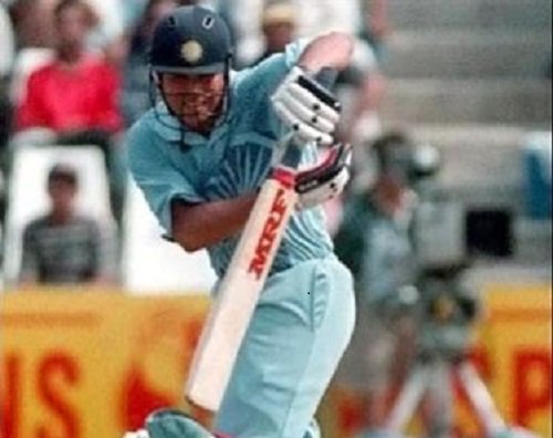
7. 1998
This jersey was completely blue apart from the team name in yellow. The jersey had the BCCI logo as a watermark all over it.
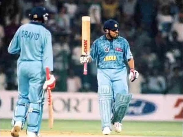
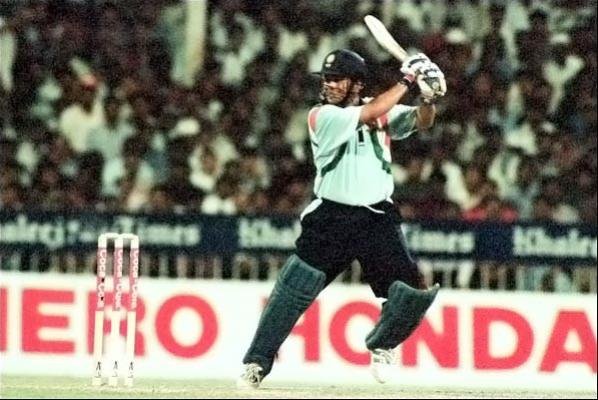
8. 1998
In 1998, India changed its jersey yet again. This time, it was blue with a band of the tricolour on the shoulders and wings.
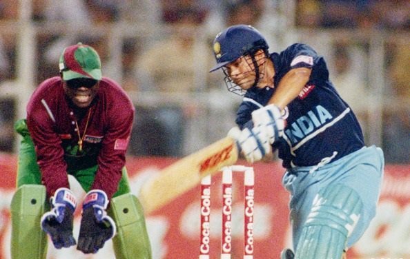
9. 1998
There was yet another change in the jersey that year. This time it was entirely dark blue with ‘India’ written in a lighter tone.
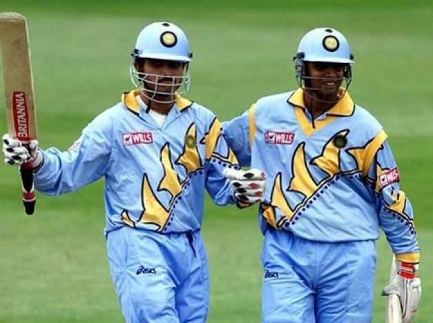
10. 1999
The yellow collar was back and the yellow corner of the emblem hugely enlarged across the chest and arms. India donned this jersey for the 1999 World Cup in England.
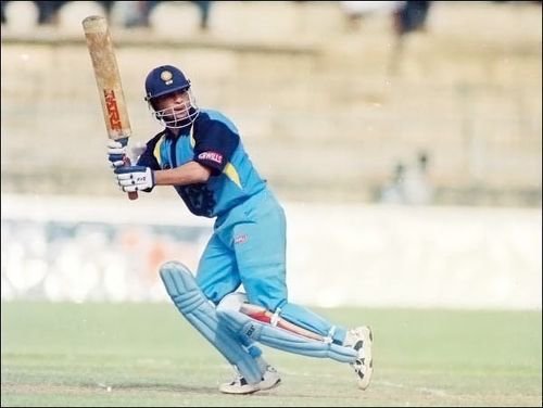
11. 2000
The collar changed back to navy blue and the emblem was placed exactly at the centre of the jersey in navy blue as well. The general tone of the jersey was light blue.
12. 2001
This was one of the last jerseys that had no sponsor across the front. The general tone was light blue with India written vertically on the right side in dark blue.
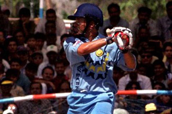
13. 2000-01
This jersey was used for a while before Sahara took over. It had a yellow curve and stripes below it, accompanied by a dark blue collar. The jersey was light blue.
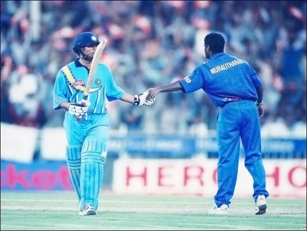
14. 2001
Sahara had become the official sponsor and was printed across the front with yellow stripes below it.
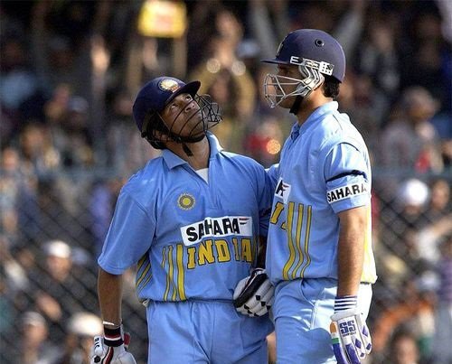
15. 2002-03
The jersey was completely light blue with the tricolour stroked in a paintbrush style from the bottom to the centre of the shirt.
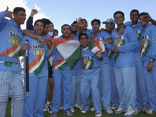
16. 2003
India wore this one to the 2003 World Cup. It was pretty similar to the previous one apart from the dark blue stripe on the sides.
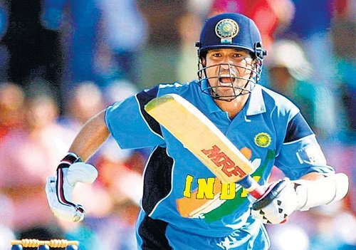
17. 2007-08
This jersey came in after a while. The change was a stripe of the tricolour going up the right side of the jersey in a swirl. This was also used at the 2007 World Cup.
18. 2009-10
This one was similar to the previous one except that the colour had changed from light blue to navy blue.
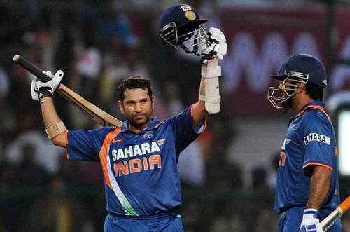
19. 2011
Another World Cup had arrived and this one proved to be lucky as India won the cup. The jersey was somewhere between dark and light blue with tricolour stripes on either side. Sahara as the sponsor was again on the left sleeve.
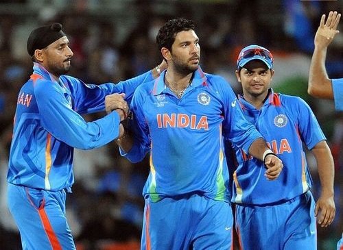
20. 2012
The tricolour had been shifted to the left shoulder with the emblem seemingly at the centre of it. Sahara, this time, was back again across the chest.
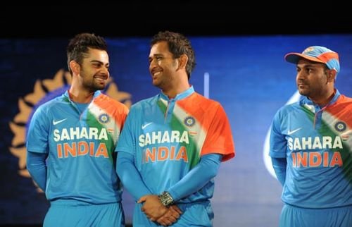
21. 2013-14
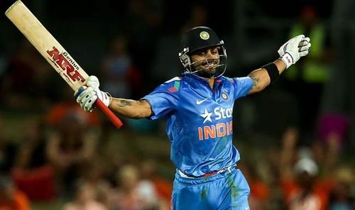
The sponsorship had been handed over to Star this time and the jersey changed significantly. The tricolour was now shifted to the shoulders in a triangular shape.
22. 2015
The jersey has been modified again in time for the latest World Cup. There is no tricolour anywhere. It is plain blue with the sponsor and team name in the front. The pocket lining of the track pants is also orange.
