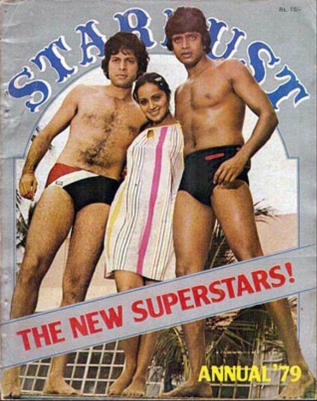
Vintage Bollywood has always been an interesting topic of discussion. Because, let’s face it, some of the fashion and photoshoots were absolutely wild back then. Which is why we thought of compiling a list of the most WTF magazine covers in B-Town history. Take a look.
1. I cannot take my eyes off of Akshay Kumar’s moustache and also what an awkward kiss!
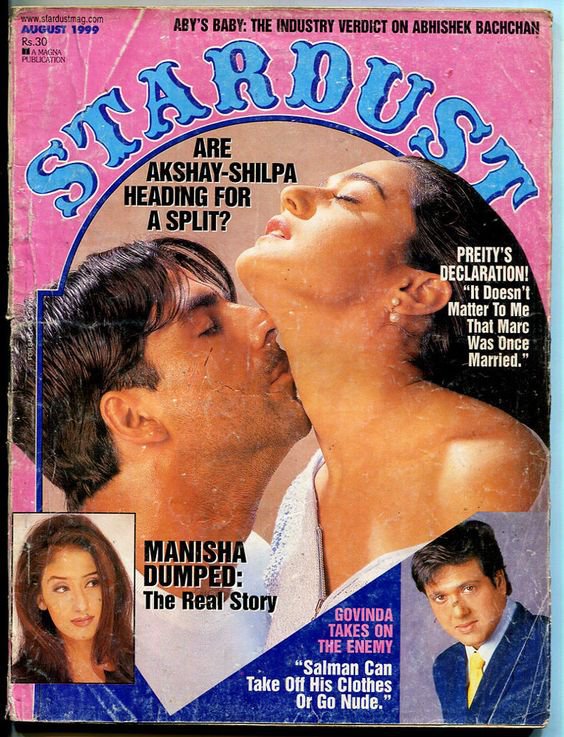
2. Such an interesting pose Sushmita Sen and Ajay Devgn have struck here.
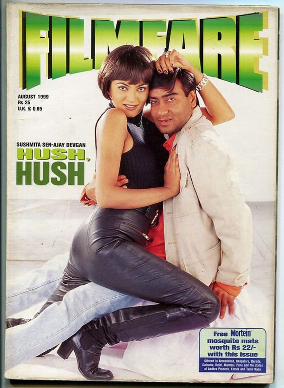
3. This cover with Karisma Kapoor and Akshay Kumar feels like I am looking at a gym class advertisement.
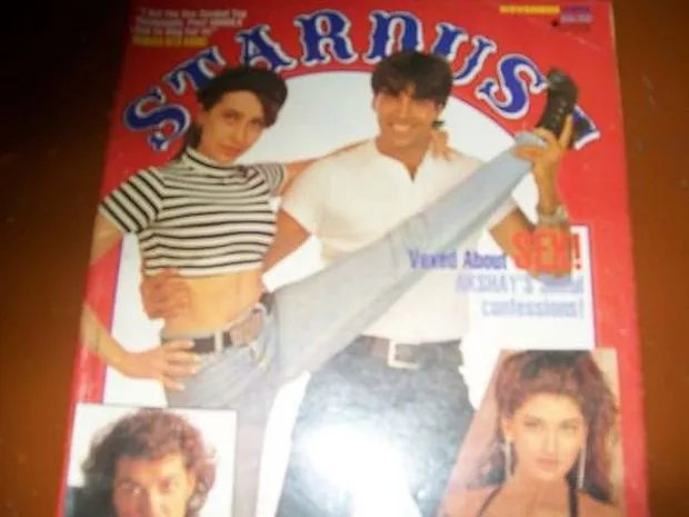
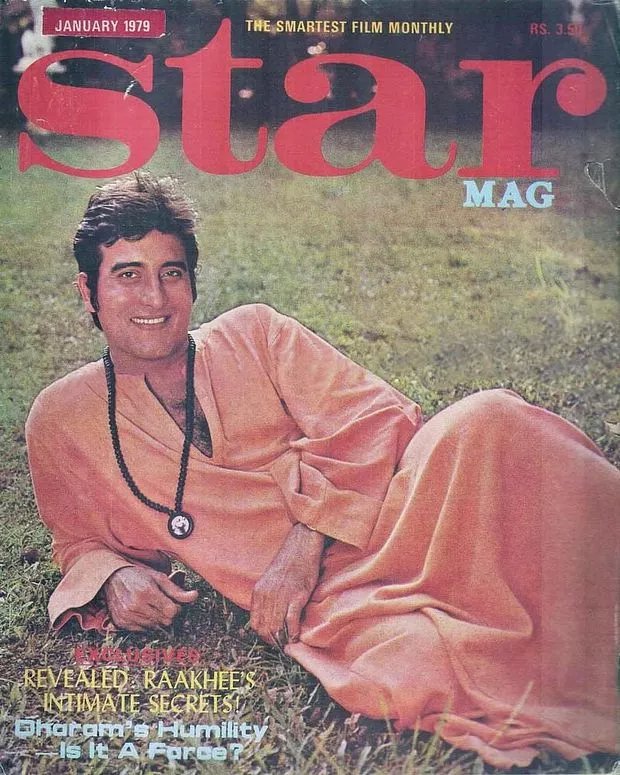
4. And this cover with Vinod Khanna looks like an advert for an Ayurvedic spa retreat.
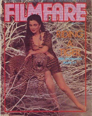
5. Mandakini looks so uncomfortable here, almost like ‘Please don’t make me lean on this creepy, and almost real looking cheetah.’
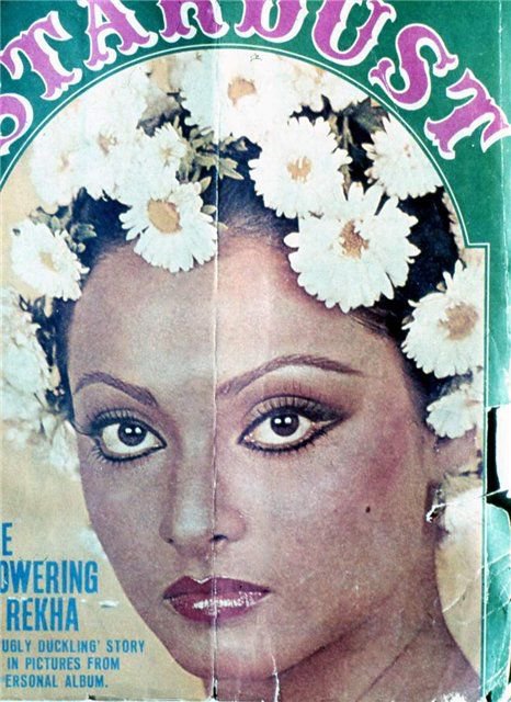
6. It’s not Rekha, it’s the flowers. And I can’t even put my finger on it, but this flower arrangement looks off.
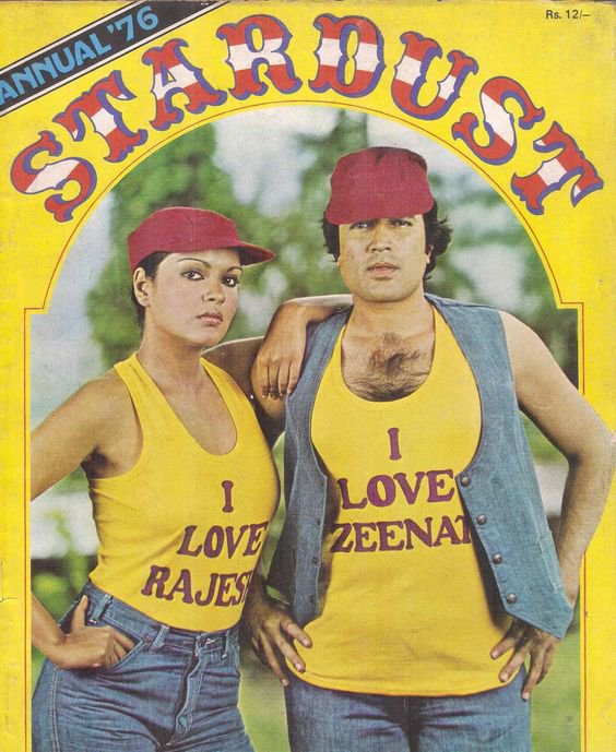
6. It’s almost like they didn’t like each other so the stylist had to make them wear T-shirts that said they did.
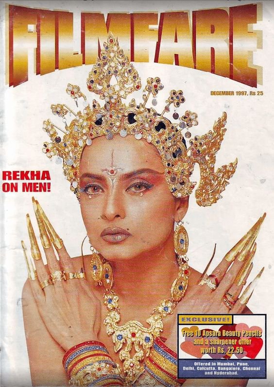
7. Rekha be looking like some distant planet’s royalty. Because those gold nails are bizarre.
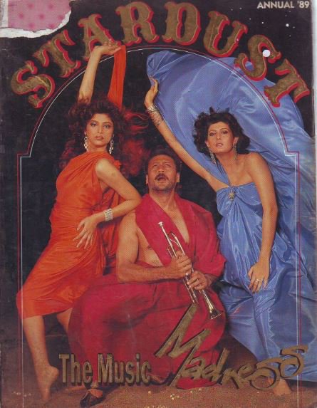
8. Okay but, for real. Where is Jackie Shroff’s left leg?
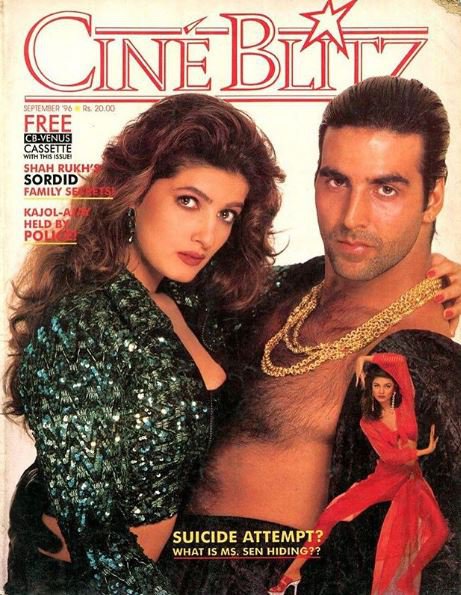
9. There is a lot going on, on this cover. Sushmita Sen doing Jedi moves, Akshay Kumar in a pile of gold chains with his hair extra shiny and slicked back. Just a lot.
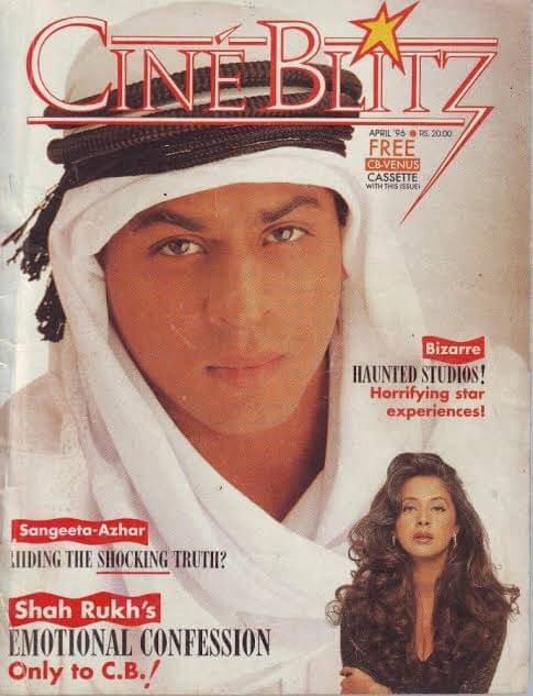
10. Cultural appropriation, is that you?
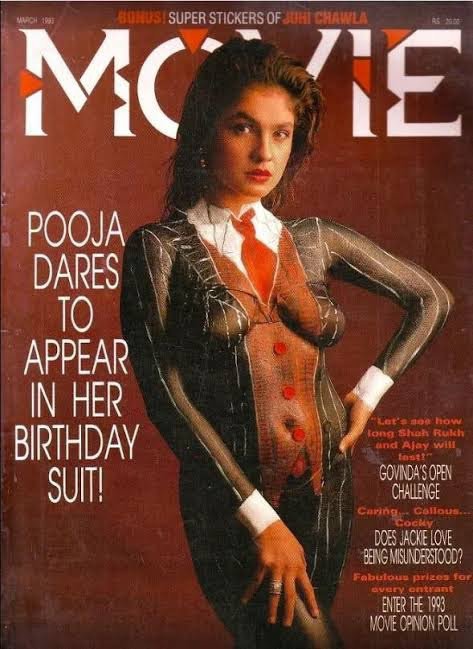
11. There is nothing wrong with the nudity, but the body paint job definitely looks off.
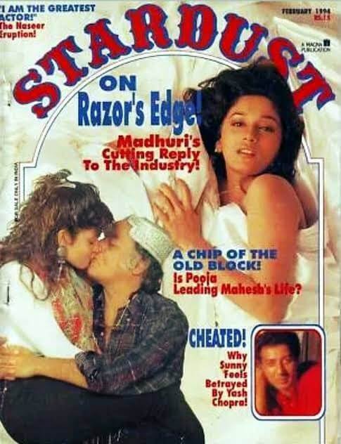
12. Okay, I am just going to say it. That father-daughter kiss is really uncomfortable to see.
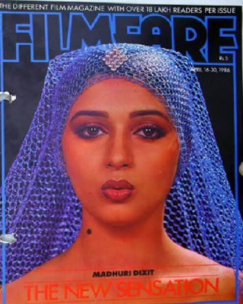
13. Uhh… it looks like the stylist was super inspired by Star Wars.
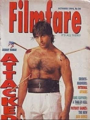
14. Just a little too much violence and machismo here.
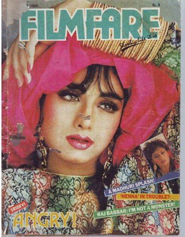
15. Sridevi looks gorgeous, but what exactly is that on her head?
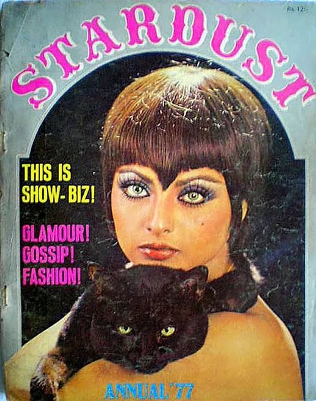
16. Real talk, is anyone else having a hard time averting their eyes from that haircut?
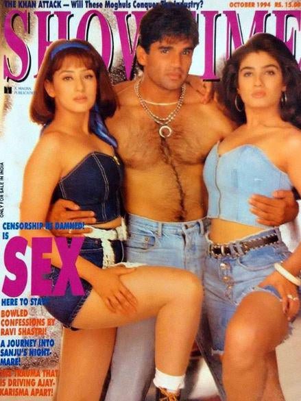
17. Why does it look like none of them are truly comfortable here?
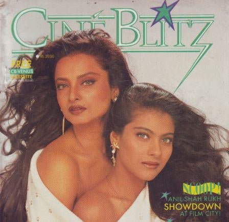
18. I don’t know what concept they were going for in this shoot, but Rekha and Kajol being in the same top is just a violation of each other’s personal space.
17. This mag cover looks like someone spontaneously asked the celebs to smile at the camera because just look at how confused both the gentlemen in this photo look!
Well, they still added a whole lot to the culture!
Top picks for you


