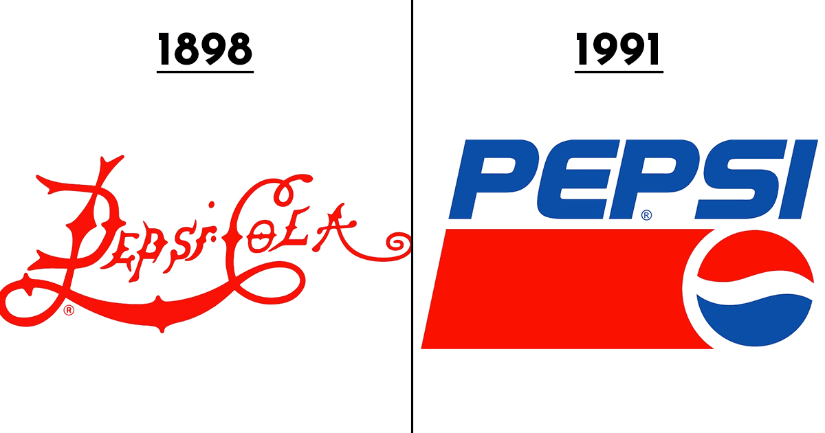
Since Brad’s Drink became Pepsi in 1898, a lot has changed – especially the logo. Over a century of its legacy, the logo has been changed some 13-14 times. And once again, a change is here! Taking away from the more minimalistic approach brands are going for nowadays, Pepsi has gone back to a logo which is pretty similar to its 1987 one. Have a look!
Check Out | 7 Popular Brands That Started Out With Completely Different Names
Like everything on the internet, the netizen have pretty mixed responses to this change as well. Some of them are absolutely loving this change.
ADVERTISEMENT
ADVERTISEMENT
ADVERTISEMENT
While others don’t like it so much, especially the font, and think that the previous one was much better.
ADVERTISEMENT
ADVERTISEMENT
ADVERTISEMENT
ADVERTISEMENT
Do you like this retro retrieval or do you think it might have the fizz but not the rizz?
Top picks for you


