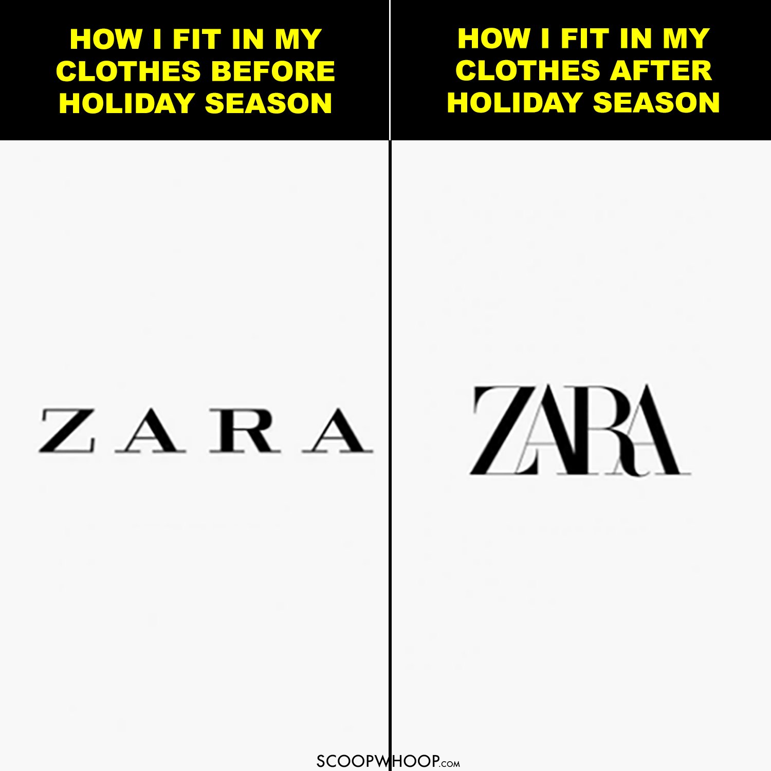
It’s like they made their logo wear a tummy-tucker.
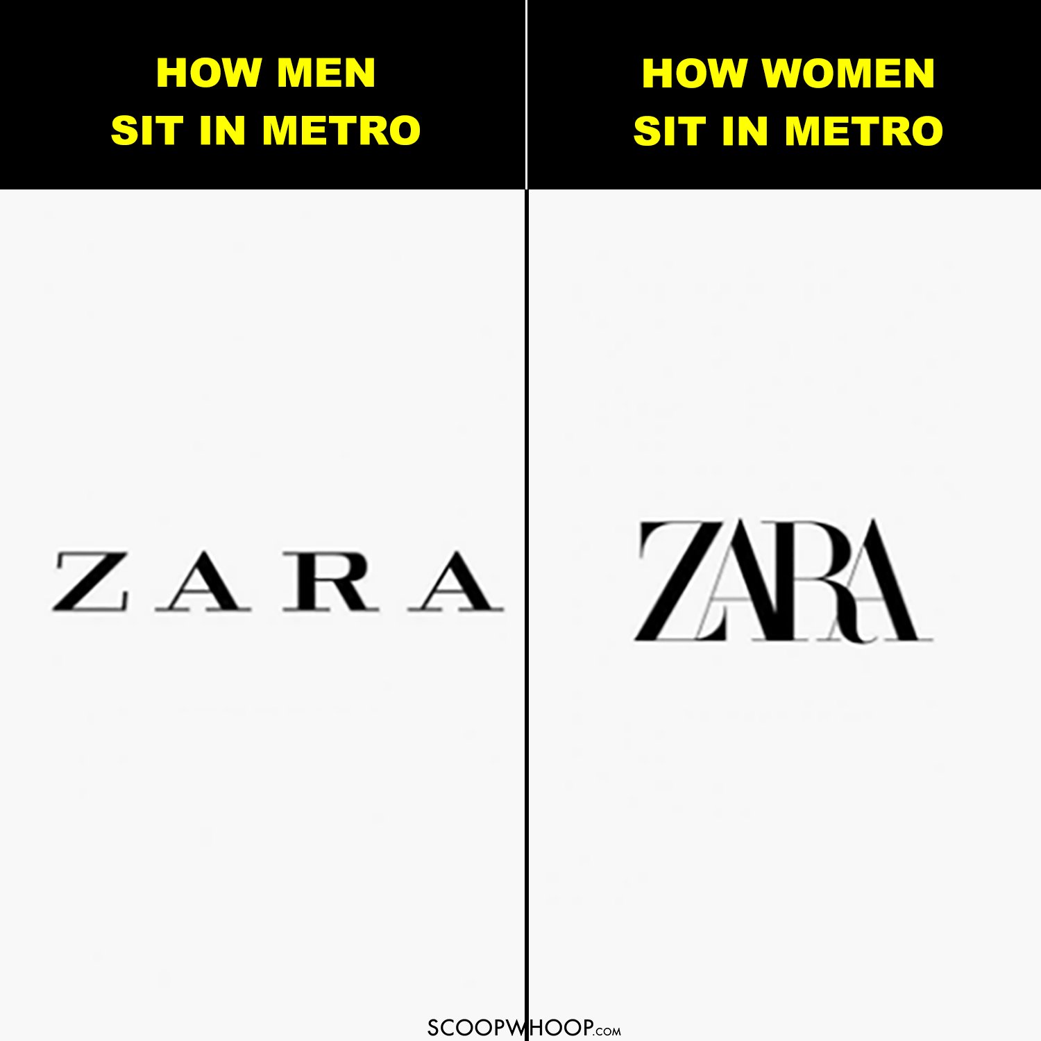
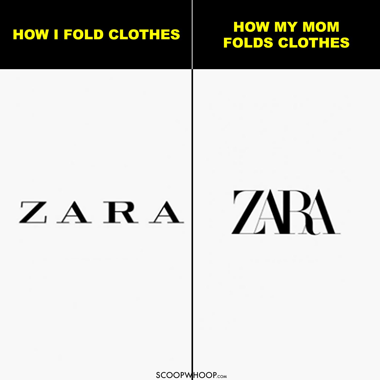
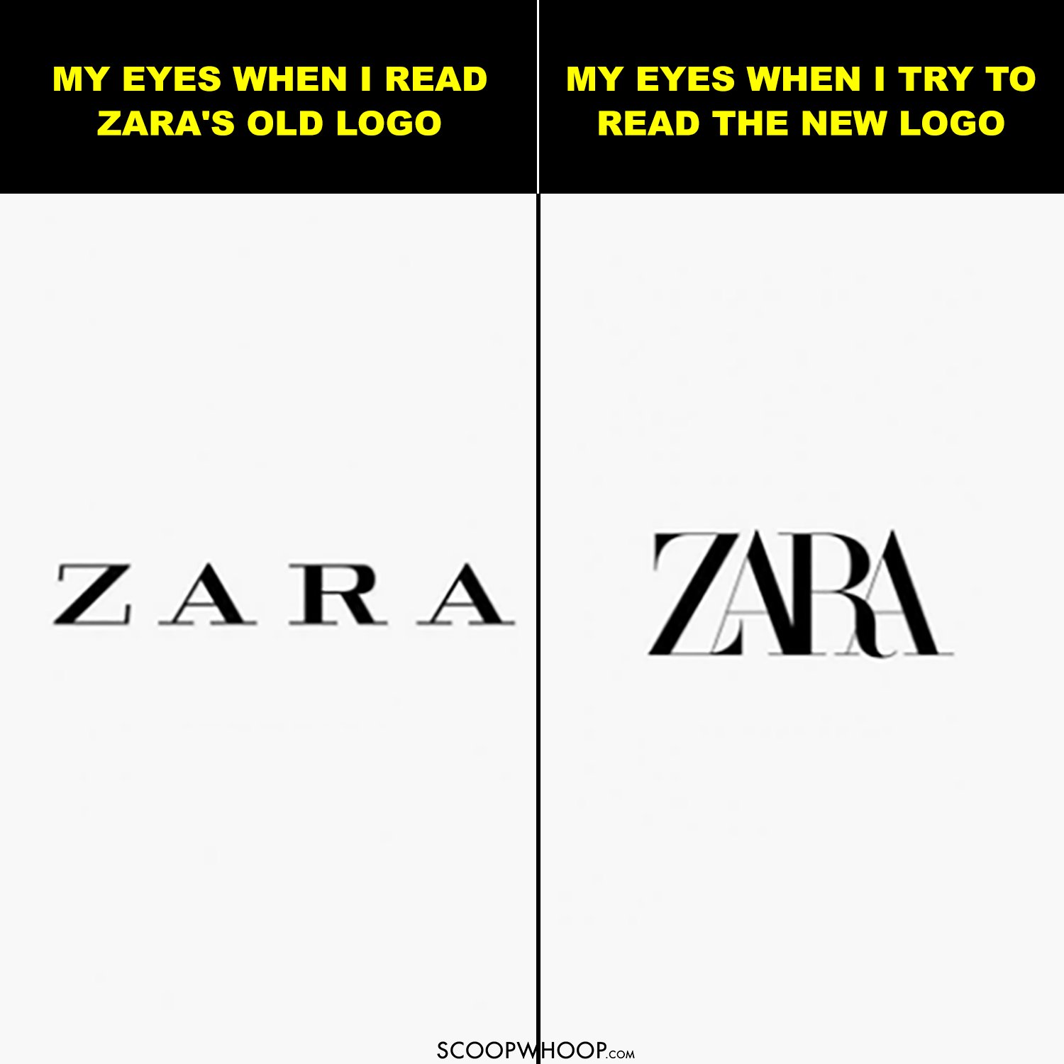
Zara just updated their logo and cramped up the previously evenly spread letters into an overlapping order.
According to News 18, this is the second time Zara has changed their logo in its 45 years of history. Designed by Baron & Baron design house, their logo is zara hatt ke.
So we tried having some fun with the old and the new logo.
It seems like even Twitter is squeezing in new memes out of this update.
Zara’s new logo is like me fitting into a shirt two sizes too small. pic.twitter.com/VGwiHPPqb4
— Abhishek Baxiابھیشیک अभिषेक (@baxiabhishek) February 5, 2019
The new Zara logo is honestly perfect, in that it perfectly illustrates how I feel when I’m in Zara constricted, anxious and stressed pic.twitter.com/hKxZ5VRdU8
— david (@dvidmaguire) January 30, 2019
Zara’s new logo is making me claustrophobic. 😨 pic.twitter.com/uSHylbzNCH
— Howard Pinsky (@Pinsky) January 29, 2019
I memed #designerhumour #zara #zaralogo #brand #tracking pic.twitter.com/4C7VhYe2Uu
— Tim Davis (@holopress) January 31, 2019
The letters in Zara’s new logo when they’re closing in pic.twitter.com/AhJESARIvY
— Armani (@ArmaniLadow) January 30, 2019
ZARA updating their logo over the years pic.twitter.com/jFBvGg7Sg7
— WisamN. IT (@WisamNIT) January 30, 2019
The real reason behind the #ZARA logo is “Winter” pic.twitter.com/oBgL7H20oo
— Mandar Karane (@me_mandark) January 30, 2019
#Zara logo is relatable as it’s a size 14 trying to squeeze into in a size 8#zaralogo pic.twitter.com/2DacxRBIh5
— Michael Badham (Double Verífied) (@Badham) January 30, 2019
How my handwriting progresses throughout an essay #zaralogo #zara pic.twitter.com/ofi4KNWG29
— Em (@notemaeig) January 30, 2019
The new #Zara logo definitely captures what it’s like to walk around one of their stores during a sale pic.twitter.com/UJSX1OXKfP
— Stefanie Preissner (@StefPreissner) February 5, 2019
The new Zara logo looks like the old Zara logo wearing a Zara slim fit shirt. pic.twitter.com/9fV6dCz6JP
— Sahil Shah (@SahilBulla) February 5, 2019
What do you think?
Design credits – Muskan.