So all your life you innocently thought that the ‘M’ in the McDonald’s stands for well, McDonald’s. Ah! But seems like there’s a hidden meaning behind the logo.
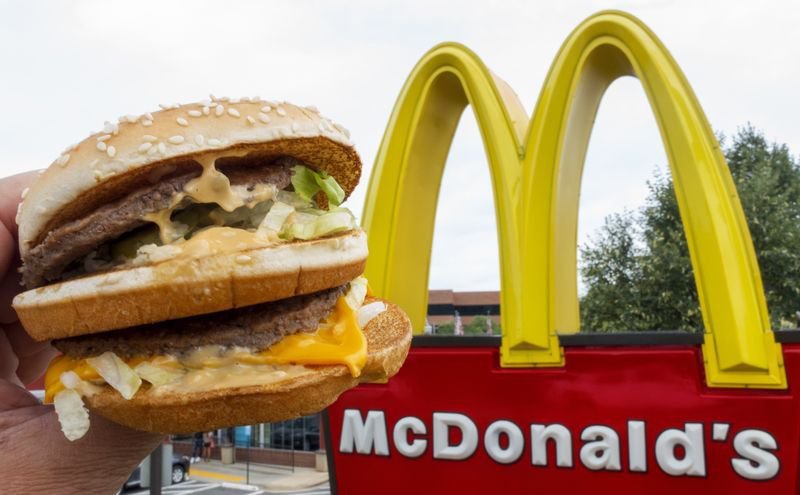
The bright yellow M that calls out to you every time you’re in mood for some dirty calories stands for something we’d never have thought of.
When McDonald’s was trying to change its logo in the ’60s, psychologist and design consultant Louis Cheskin asked them not to. Why, you ask?
Well, because according to him, if we were to apply the Freudian theory, the beautiful golden arches actually represent, ummm, a pair of nourishing breasts.
Wait, what?
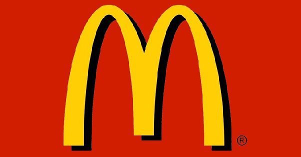
Yes, that’s right! They stuck with the logo with this revelation by the psychologist as he further added that the logo subconsciously will make people link it to maternal breasts (or, maybe just breasts?) and make them feel hungry.


