Every time you watch a movie, it begins with the logo of the production house. Although there are many many production houses in Hollywood, there are only a few of them which have managed to make their logos memorable. And if you’ve been a serial movie-goer in the past decade, you’ll have realised how these logos keep changing a little every few years. And if you look at their logos from when they began, you’ll realize that there is very little similarity that they have with their current versions.
Here is a comparison of some such logos from when they first appeared and how they look now:
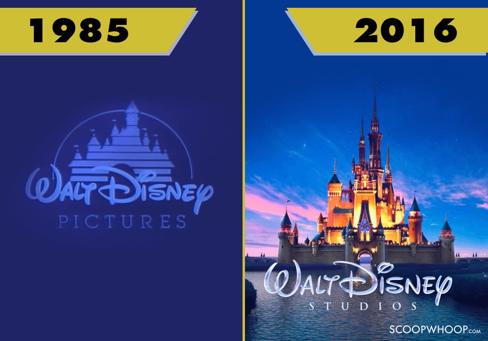
1. Walt Disney
This may come as a big surprise, but Disney pictures did not use a logo for its movies until 1985. They used only the words ‘Walt Disney Presents’ until then. Their first logo was a silhouette of the now-iconic Disney castle on a blue background. The logo, however has changed with time and now features a computer generated and almost life-like image of the castle.
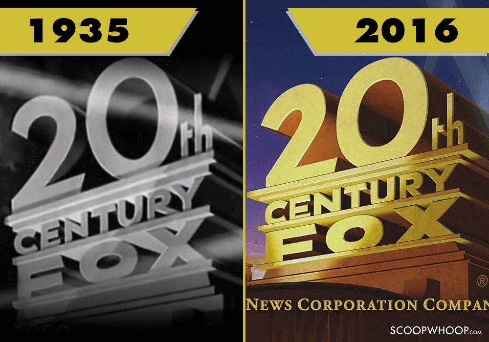
2. 20th Century Fox
The 20th Century Fox is a studio that hasn’t changed its logo a lot. The tall Deco-ish facade and the searchlights have been in the logo since the very beginning. It was originally created by matte artist Emil Kosa Jr. The most prominent changes have been in the number of searchlights and the music accompanying the logo.
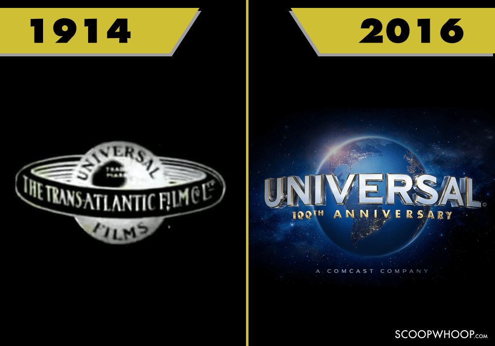
3. Universal Studios
The Universal Studios logo has changed a lot over the years. But it has always featured a globe in the centre. The text around the globe has changed over the years. When the logo was featured for the very first time in 1914, the text surrounding the globe was “Universal Films—The Trans-Atlantic Film Co.” The movie studio currently shows a computer-generated beautifully designed CGI logo which was launched on its 100th anniversary.
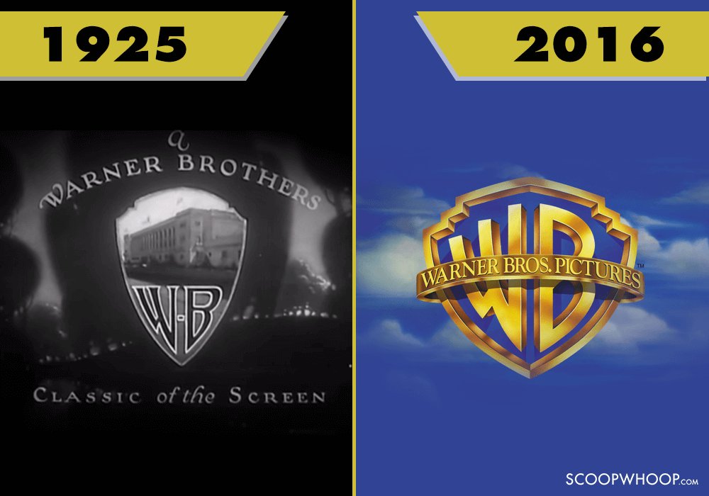
4. Warner Bros.
In the earliest versions of the Warner Bros. logo, the letters WB were inscribed on the lower half of the iconic shield. The upper half had the image of the studio from Burbank, California. Then for 12 years, from 1972 to 1984, there was no shield, and logo featured a stylised W, usually white or red, on a black background. Today the logo features the photos of their studio which slowly fades into the WB shield suspended in the clouds, as the melody from “As Time Goes By” plays in the background.
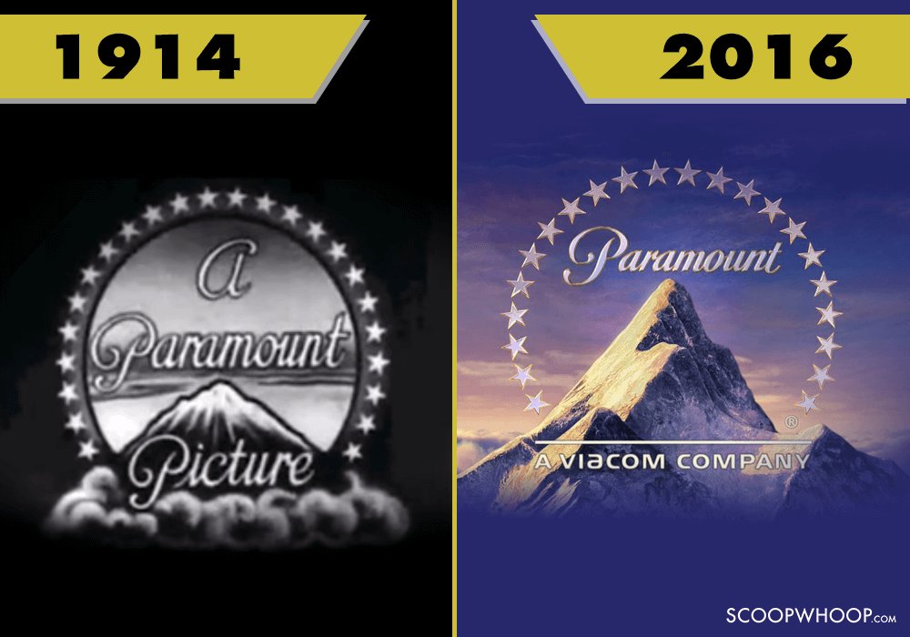
5. Paramount Pictures
Paramount’s enduring symbol, the ‘Majestic Mountain’ was drawn on paper by WW Hodkinson. The Ben Lomond Mountain in Utah was said to be the inspiration behind the drawing, However, the mountain in the current logo is supposedly modelled after an Andes peak in Peru. the number of stars in the logo has also decreased from 24 to 22.
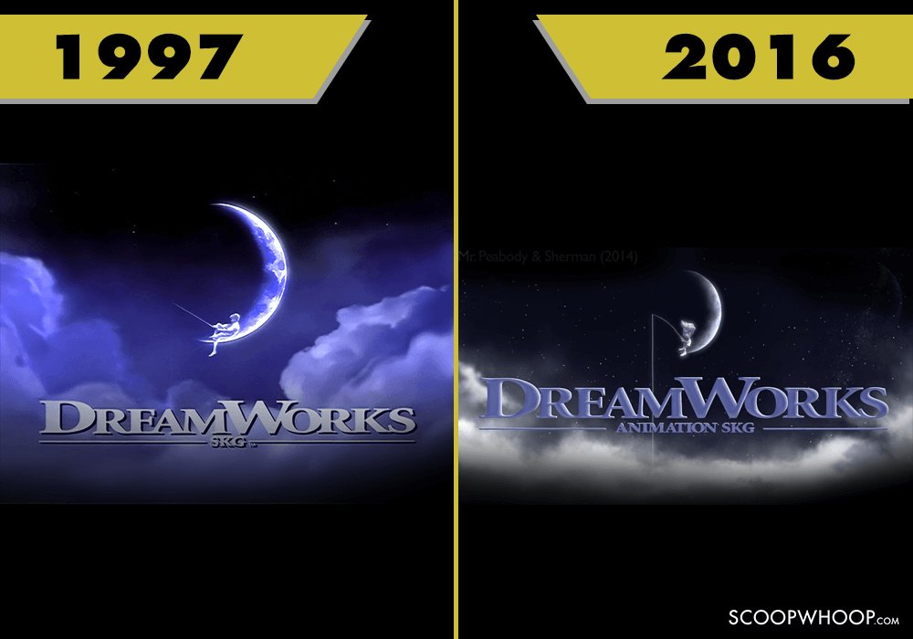
6. Dreamworks
For the Dreamworks logo, Steven Spielberg always wanted to use the image of a man fishing from the moon. He suggested this idea to his friend Dennis Mueren, who was reminded of a similar painting by Robert Hunt. Hunt suggested that Steven a child instead of a man. Spielberg agreed, and used his son as a model. The letters SKG on the logo stand for Spielberg, Katzenberg, and Geffen, the three founders of the company. However, Dreamworks is also known to vary its logo depending on the movie. For example, it used Master Oogway holding the fishing rod in one of the Kung Fu Panda movies.
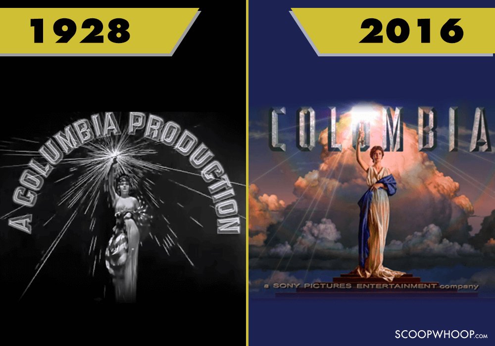
7. Columbia Pictures
The woman in the Columbia Pictures logo was believed to be modelled after Evelyn Venable, the actress who played Blue Fairy in Pinnochio. Earlier she used to hold the American flag, which was later replaced by a simple blue drape. The current logo came into being in 1992, when New Orleans designer Michael J Dias decided to give the lady a torch to hold in her right hand.
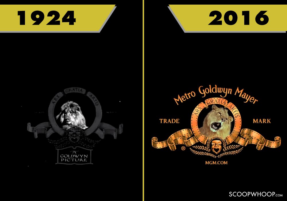
8. Metro-Goldwyn-Mayer
The MGM Pictures was founded when Goldwyn Corporation was merged with Metro Pictures and Louis B Mayer Pictures. A total of seven lions have roared for the MGM logo. As far as the design is concerned, it hasn’t changed much. Ever since the first logo, the words ‘Arts Gratia Artis’ adorn the arc above the lion’s head. The words are latin for ‘Art for art’s sake’.
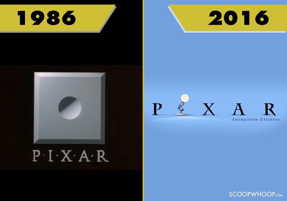
9. Pixar Animation Studio
The first Pixar logo was created by their Chief Creative Officer John Lasseter, along with a stone cutter. And thus, the first logo does look like the front face of a stone. However, it has now been simplified and only has the text without the dots separating the letter.
Wow! The logos have changed a lot. We wonder how these logos would look like 50 years from now.
Design Credits – Ankita Patel