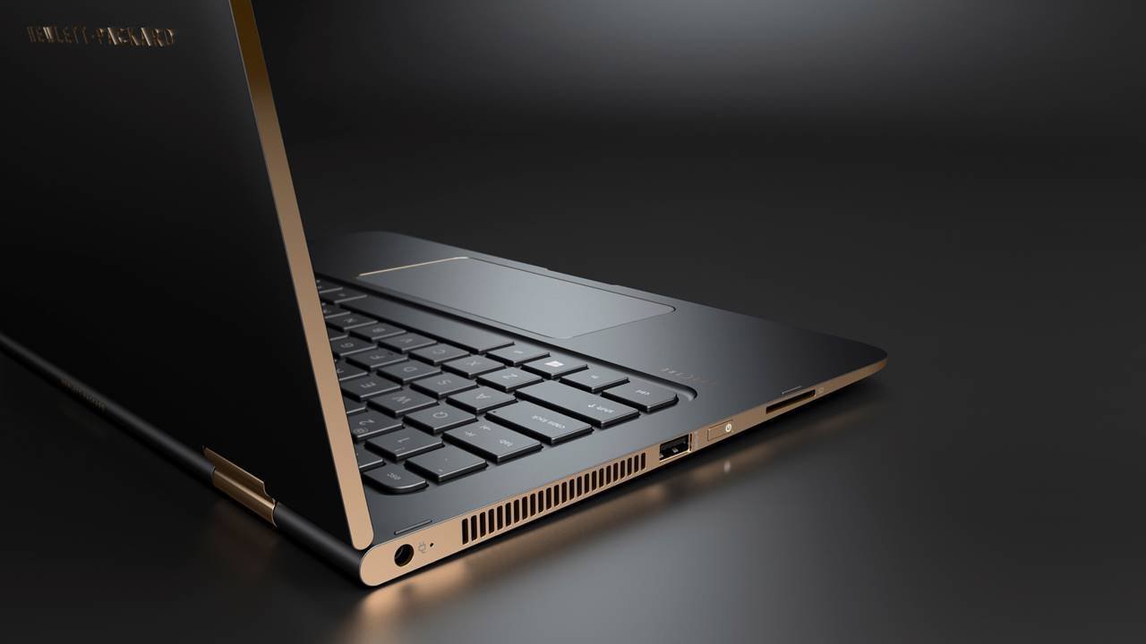
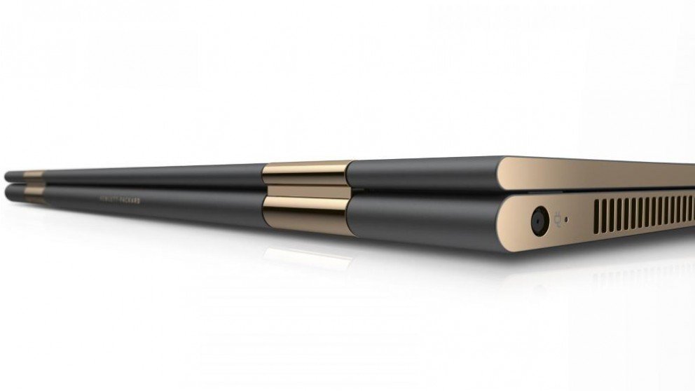
A few days ago, HP unveiled their latest creation, the Spectre, the slimmest laptop in the world. And after seeing the images of the laptop, it’s pretty easy to understand why the world kinda lost its shit.


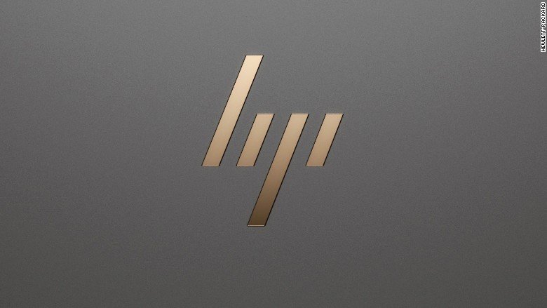
And now it turns out, that’s not the only new thing HP have unveiled. The tech giant just released a new logo for their premium laptops and we’ve got to say, it looks pretty damn sleek, almost as sleek as the Spectre itself. I mean, just look at it.

And the Internet’s reaction to it seems more than positive.
I gotta admit, if this is HP’s new logo, it’s really dope. pic.twitter.com/jOBbhScRHi
— Josh Helfferich (@JoshHelfferich) April 6, 2016
The new HP logo is actually lowkey pretty dope 🔥🔥 pic.twitter.com/1axQXs44qq
— Marques Brownlee (@MKBHD) April 6, 2016
New HP Logo is gorgeous pic.twitter.com/gH3FPI0Mbb
— V / T I E D ^ (@vnmstr) April 6, 2016
Surprisingly, the logo is not a recent creation. The logo was created 5 years ago, but the powers that be at HP decided against using it.
Looks like HP is adapting a new logo they explored back in 2010. https://t.co/B5UfmxPz1v pic.twitter.com/dgk0pLyf2G
— Tobias van Schneider (@vanschneider) April 5, 2016
Guess even they couldn’t deny awesomeness that is the new logo.


